.png)
HOW TO PLAN YOUR INSTAGRAM FEED FROM A BLANK SLATE (WITHOUT THE PANIC SWEATS)
- Aug 8, 2025
- 6 min read

I had the panic sweats. Don't worry. I'm here for you. Not in a creepy way. In a 'let's get you a glass of water and maybe out for a walk to clear your head' type of way.
Instagram is incredibly tough competition these days. The landscape is crowded, and everyone is suddenly creating the most creative, unique ways to get you to 'stop your scroll' (I f*cking loathe that phrase.) When I was planning for Spill, I took a few hours to follow creators that were creating content that not only was helpful to me, but also inspired me to create something that not only reflected myself and the brand I've created to represent me, but also to say things that are:
Actually real, helpful information that can help others.
Sell my services to those in need of help to grow their business.
Maybe your business will curate that checkerboard grid that has everyone in a chokehold (me, included), or you'll decide that staying true to your branding is key and you don't need to feed plan as long as your post covers stay by the book. On a platform as creative as Instagram it's both a pro and a con that there is an infinite number of ways to represent your brand visually.
Whether you’re DIY-ing your presence or hiring freelance social media management, this will set you up with a grid that wins attention and keeps it.
WHY GRID-FIRST PLANNING WORKS (ESPECIALLY FOR SMALL BUSINESSES)
There's a good chance that if you go searching for a local business, they may just be posting whatever's handy. This could be an event flyer, some quick photos of their products and services, local sponsorships, etc. A high-performing feed is designed like a storefront: clear, inviting, and consistent.
Planning with a feed-first mindset allows you to:
Clarify your visual identity. This reduces the randomness and need to grab those generic Canva templates that have the chance to confuse your customers or leave a bad impression.
Reduce decision fatigue when deciding what to post today. That's a spiral that is all too familiar and can and should be avoided at all costs.
Create a great first impression without even saying, "Hi!" Your top six posts do more selling than you think.
Make every post work harder. With the correct planning, every post will be strong, but collectively add to a larger strategy.
These are the bones of social media management that actually move the needle (and your bottom line, most importantly!)
STEP ONE: TIGHTEN YOUR VISUAL IDENTITY
Before you start with pen to paper planning on how you want your grid to look, you need to set the tone. The vibes, if you may. Whatever cringy word you wish to use, I'm here to enable you to do it. Teamwork!
Do some reflecting:
What do you want to be known for? Choose three "style" words that will serve as decision makers. Try choosing one practical, one aspirational, and one emotional word to really lock in your perfect tri-fecta.
Spill's are magnetic, fresh, and authentic.
Struggling? Try an adjective generator to get your mind rolling.
Your color palette. This is fun. It took me four months to nail down mine. I only hope you're not as indecisive as I am. The typical formula is 2-3 primary colors and 1-2 accent colors. If you already have a logo, make sure those colors are represented.
Make sure you mix and match contrasts to make sure text can stay readable in light or dark photos, and that all of your colors mix well.
Great free resources to play around with color are Adobe Color in the early stages, and Canva in the later stages to make sure they again, mix well.
If you're still struggling, try Pinterest to start searching for inspiration to take notes from.
Pick an editing style. Light & airy, rich & moody, or crisp & true-to-life? Commit to one. Consistency builds recognition.
Make sure to decide on something that is practical and you will be able to emulate on the day-to-day easily. Choosing to animate all of your posts may serve as a posting strategy that isn't feasible due to the time it takes to do so.
Google editing styles or search on Canva's template tools to help define your style. Your style words will also help guide you here.
Texture and typography. Do you have set font styles? Try to keep this to only two or three fonts. One for a logo. One for your headings. And one for longer paragraphs.
Define what fonts will be used for your headings and as a paragraph style. Will you utilize bold and italics? Only use uppercase or lowercase in headings?
Will you be using your logo font if you have one? Decide if you want your logo font to be used only within your logo or within your brand assets. I, for example, only use the cute 'Spill' font exclusively in my logo because it can be hard to read at times.
This pre-work is what separates brands with cohesive feeds from feeds that look like a flea market. At Spill Social, when I onboard a new Instagram management client, we treat this step like brand therapy. Your visual vibe sets the tone for every post you’ll make, so skipping it means you’re building on shaky ground.
STEP TWO: CHOOSE A GRID STRUCTURE THAT FITS YOUR BRAND
Think of a grid as a rhythm your audience can feel. The pattern/structure you decide on doesn't need to be elaborate, but it can give you guardrails so everything can flow.
Here are some grid patterns to help you begin your planning process:


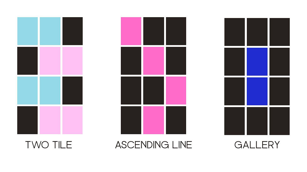
Remember that these are simply a visual guideline to take some stress out of the design process. The colors can represent different styles of photography, infographics, product shots, etc. We'll define that next.
STEP 3: DEFINE YOUR CONTENT PILLARS (BEFORE YOU START DESIGNING)
Your grid should reflect your business model, not just your mood. Content pillars are the categories you rotate your posts around to make sure your feed is balanced and strategic.
Decide what type of content will represent each block in your grid pattern. Choosing a color AND a post topic avoids decision fatigue/stress for both images and content.
If you're not sure what to be posting, reach out to me! You can send me an inquiry here to help define what is important to your customers and how to communicate in a way that resonates and has longevity.
STEP 4: PLAN YOUR FIRST IMPRESSION (YOUR TOP 3 POSTS)
People judge whether to click off your profile in seconds. Instagram allows you to pin three posts to the top of your page so they are the first thing that your prospects will come across when they visit your page. Attention span is shorter than a goldfish these days, so these need to be representative of your brand, look good, and, again, most importantly, communicate your value proposition.
Design those first three tiles intentionally:
Instant clarity: In one quick scroll, can a stranger understand what you do and why they should care?
Visual variety: Alternate compositions (close-up, mid-range, text). Avoid two similar shots side-by-side.
Lead with value: Your first row should teach something, not just announce your existence.
Surface the face(s): Human connection drives trust. If you’re the brand, show up.
Think of the top of your grid like a movie trailer: short, punchy, and representative of your whole experience.
When I manage Instagram for Spill Social clients, I make sure the feed works on two levels:
The macro view – the overall brand impression when you see the grid.
The micro view – each individual post’s strength and performance.
STEP 5: CREATE A REUSABLE ASSET KIT
This is where Instagram management gets efficient. Build a lightweight system you can use for months. Here's where I'd start:
Five text-post templates (for tips, myths, quotes, carousels, promos)
One cover style for educational carousels
A Lightroom/VSCO preset for consistent editing
A background/texture set in brand colors (subtle gradients, paper texture, soft shadows)
A shot list (founder headshots, workspace scenes, detail textures, product/service context, approved stock photos)
With a kit, you don’t reinvent the wheel every week—you just swap content into reliable formats. That’s time-saving, smart social. Booooom.
EDITING & VISUAL CONSISTENCY: THE FAST RULES
One preset across the feed (tweak exposure/white balance per photo).
Consistent shadows/highlights: Don’t swing from harsh to flat lighting.
Type discipline: 1–2 fonts, predictable hierarchy (headline, subhead, body).
Whitespace is a design tool: Your grid needs “breathing” posts. Simple, clean slides that reset the eye.
Consistency is memorable. Memorable is clickable. Double boom.
EXTRA TIPS:
Plan your first 12 posts before you publish a single thing. Seeing them together helps you spot awkward repeats or off-brand colors before they go live.
Think in rows, not just squares. People scroll fast, but they also see your posts in rows of three. Make sure each row tells a mini-story or has a visual balance (color, composition, and subject).
Revisit your grid monthly or quarterly. Your first plan isn’t permanent. As a freelance social media manager, I review my clients’ grids every month to tweak patterns, update colors, or shift content pillars based on performance.
Design for the Scroll AND the Save. A post that looks great in the grid but doesn’t give value won’t perform long-term. Always ask: “Would someone save or share this?” The answer should be yes.


Comments